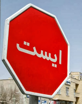
Most of us are aware that viewers respond to pictorial
signs, for we are visual creatures and remember things we see – especially
images.
Those in advertising know pictures are key to marketing, and
these include logos, icons, pictograms and photographs. So what’s the
difference between these four? Below are short definitions as they relate to
the world of business.
Logo
In marketing, a logo is a graphic depiction or representation
of a company name and is designed for instant recognition. As mentioned in my
last post, a logo can consist of just an image, or it can be a logotype, or a
combination mark.
 The important elements of logos are scalability, and
adaptability to both colour and black and white. The first of these, to be
scalable, is because the logo must be identifiable within any media – for
instance, in a large format for a billboard poster or else reduced in size for
a thumbnail web graphic. For this reason, vector-based logos are more
common. As for colour versus black and
white: most logos generally will be produced in colour, but they need to be
recognizable in black and white too. How else would logos stand out if company
brochures were photocopied, for example? A well-designed logo will be seen and
known at any size and in any colour/non-colour format.
The important elements of logos are scalability, and
adaptability to both colour and black and white. The first of these, to be
scalable, is because the logo must be identifiable within any media – for
instance, in a large format for a billboard poster or else reduced in size for
a thumbnail web graphic. For this reason, vector-based logos are more
common. As for colour versus black and
white: most logos generally will be produced in colour, but they need to be
recognizable in black and white too. How else would logos stand out if company
brochures were photocopied, for example? A well-designed logo will be seen and
known at any size and in any colour/non-colour format.Icon
As well, icons can be animated: lines visually pulsate, buttons
change colour when activated, cartoon characters move. Emoticons are a good
example of moving icons: they are entertaining for they smile and wink at us,
poke their tongues at us, and nod their cute little heads.
Well-thought-out icons are understood globally, across boundaries of language. This is why commonplace figures such as hands, vehicles, geometric shapes, animals and humans make the best figures for icons.
Pictogram
These are for guidance and are used to protect and warn the
viewer; therefore they must be instantly decipherable.
There is an art to
creating simple, single images that convey very clear messages. Pictograms,
like icons, must cross cultural lines and be understood regardless of language.
Therefore they must resemble that which they signify, or else be globally agreed up signs. Pictograms as such are
not often used in the advertising world to market products, but they are
important in keeping us from walking off a cliff…
Photograph
In marketing, an effective shot of the merchandise – think
shoes, cars, lipstick – or an image demonstrating a lifestyle the merchandise gives
us – think hammock on the beach; being admired by observers; jumping for joy –
can do wonders for getting viewers to realize the benefits of your product.


No comments:
Post a Comment